The Truth about a Trend; Past, Present, Future
April, 26 2021 | 5 min read
By Kimberle Frost, Design & Color Consultant
First, let’s define a color trend. By definition: it’s developing awareness or an emerging preference for a color or several colors. A color trend can change the way we think about color, what clothes we wear, the furniture we buy, and most consumer products we purchase. Our perception of color significantly impacts our emotions and how we behave. Most color trends are identified by social, political, or cultural influences. Just google color trends and you’ll find 13,700,000,000 results.
Color forecasting in some form has been around since the early 1800s. Color forecasting is the practice of predicting colors. It’s both technical practice and an art. Just like the weather forecast, it’s a prediction not always a certainty. Global companies like Pantone, Color Marketing Group and PPG, (just to name a few) come together and combine their collective knowledge of what colors are relevant and communicate this information to companies for product development and marketing efforts. Having the right color at the right time can mean the difference between launching a highly marketable product or one that is viewed as outdated.
The ‘70s
My earliest memory of a “color trend” was in the 1970s, when the recession introduced us to a world of safe, somber earth tones, a total departure from the bright and psychedelic colors of the sixties. I distinctly remember my young, stylish mother in her autumn brown pantsuit and our house being decked out in every shade of harvest gold, avocado green and burnt orange, popping up in everything from appliances to linoleum floors and even wallpaper. These natural colors were far from what we consider neutrals. They became the more colorful elements of nature. Harvest gold was the most notable color from this era. It was recognized as a neutral, the way we use beige and gray today. These colors are making their way back into today’s color palettes with names like kale green, cider spice and mustard, grounding hues that create a sense of warmth.
The ’80s
I graduated from high school and college in the 1980s and with that came bold preppy plaids, monogram sweaters in lime green, and classic Laura Ashley florals. During this time, I was a bit of a nomad and found myself moving from place to place, finally landing in New York City with a zebra suede sofa, red pillows, and a Billy Idol hairstyle.
“The economic upturn of the eighties brought bold primary colors to fashion and interiors; red, blue, green and yellow mixed with black and white, and at the same time more subtle hues like the infamous mauve. “
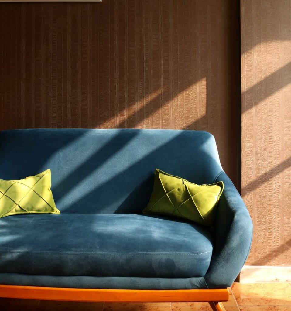
The economic upturn of the eighties brought bold primary colors to fashion and interiors; red, blue, green and yellow mixed with black and white, and at the same time more subtle hues like the infamous mauve. The mere word “mauve” conjures up visions of the 1980s power suit and pastel bedrooms. This muted shade has really never left us, it’s only shifted from rose, blush and even named millennial pink, attracting a younger non-gender designer base. It works well with cooler wood tones and when combined with taupe or gray captures a softer, sophisticated aesthetic.
The ’90s
The end of the ’80s introduced us to dirtier colors associated with gothic, grunge, and hip hop music, and by the mid-1990s, the bold colors of Apple’s iMac, urban street style and minimalism influenced color trends. This decade brought us Spice Girls, Friends, and Dunkaroos. I got married, bought my first house, and started a family.
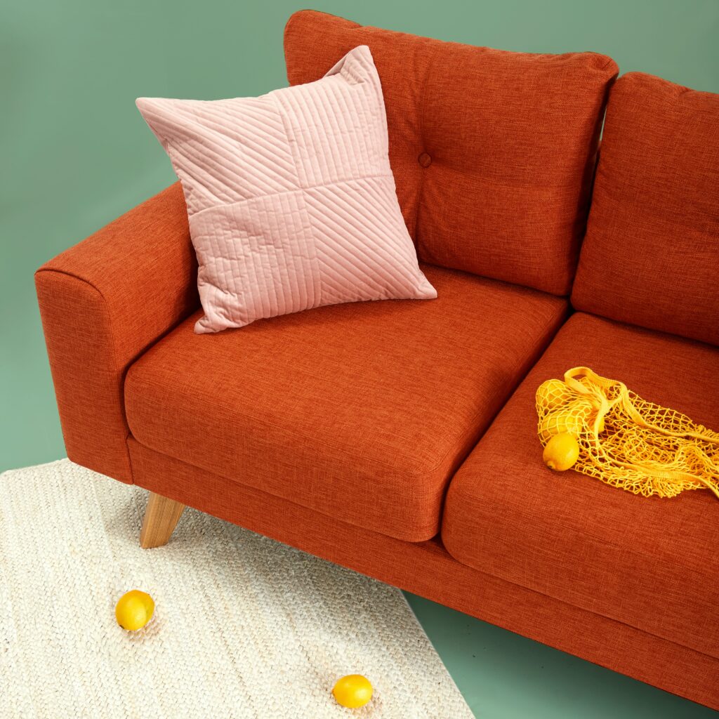
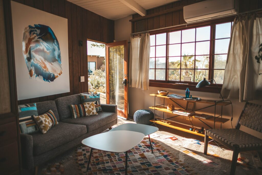
Somehow in all the chaos, I missed the minimalist movement and went straight to rich tapestry patterns, sponged walls and potpourri. Deep jewel tones were popular in the 90s. Teal was a favorite representing a youthful, sporty and iconoclastic image. Fast forward to 2020/2021, the bold color of teal is replaced by a more muted mint green combined with its complements; a version of purple (calming lilac), orange (melon) and blue (robin’s egg).
2000s and beyond
At the turn of the 21st century, we found ourselves immersed in a world of information dictated by technology. With this, there was an increase in travel destinations, socioeconomic conditions and materials, all impacting color choices. Before the year 2000, color trends were slower to materialize and lasted longer. With more resources came more change. Forecasting became a big business. Pantone introduced its “Color of the Year” in 2000. Every year since we anticipate this color announcement for guidance on products and branding. Paint companies also pick colors year after year that we use for direction.
“These color trends tend to be more nostalgic, both retro and forward-thinking, a connection to memories and the future.”
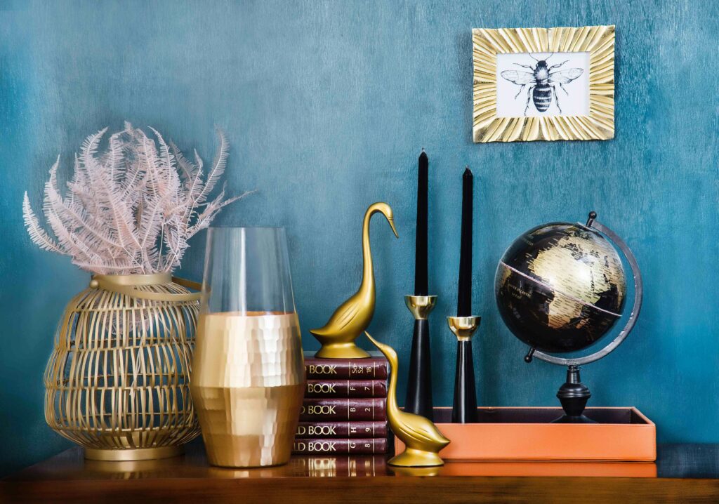
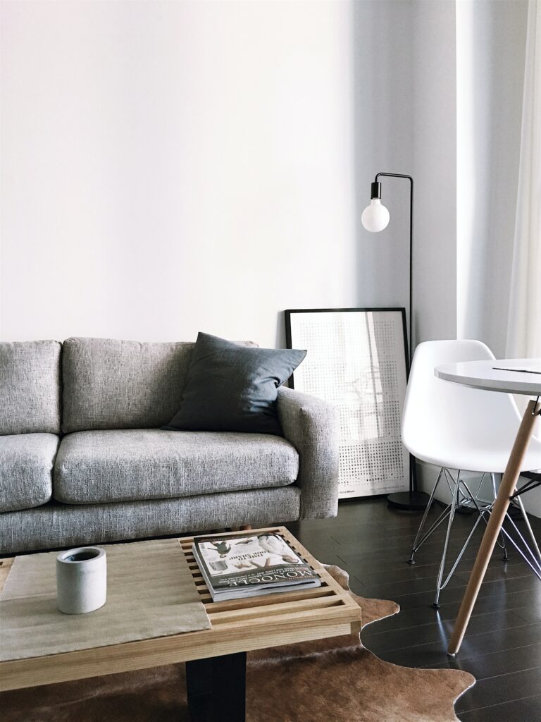
Now in 2021, we are looking for thoughtful, mindful colors to cultivate and enhance our lifestyles. These color trends tend to be more nostalgic, both retro and forward-thinking, a connection to memories and the future. We live in a world of neutrals, simple and comforting, along with pops of color to celebrate our individuality. Using botanical shades inspired by nature allows us to use color as a way to escape the noise and clutter.
I’m ready to reset my personal color choices by rethinking and rediscovering my spaces, choosing colors that enhance, encourage, and empower me. These color choices will represent my past, allow a pause in my present and look to my future, everchanging and evolving.
Author Kimberle Frost has over 25 years of experience as an independent consultant offering services in textile design and styling, color consultation, and textile marketing in both the contract and residential markets. Frost is recognized for her broad range of design and technical expertise along with her strong color sensibility.
Her portfolio includes work for highly regarded companies such as Robert Allen, Duralee, Mayer Fabrics, Momentum, Arc-Com, and Ultrafabrics. She was also Vice President of Design at Designtex for over 6 years where she was instrumental in shaping the design direction of the company. In addition to work with major jobbers and furniture manufacturers, she continues to contribute her design expertise and color vision to many domestic and foreign mill sources.