Inspired Colors of 2022 + 2023
April, 18 2022 | 3 min read
By Kimberle Frost, Design & Color Consultant
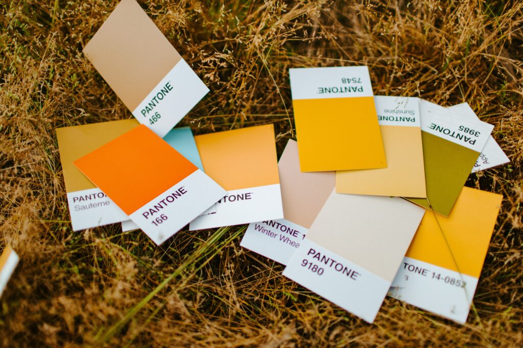
It’s safe to say that the pandemic has transformed our living and work spaces. Colors in 2020 and 2021 gravitated towards soothing, warm neutrals while also cultivating a much-needed cheerful optimism.
Colors emerging in 2022 will deliver a message of hope and renewal, signaling a more relaxed approach to work and home. These colors, both warm and cool, represent a return to the simplicity of a bygone era, the soothing aspect of nature and a focus on protecting the planet we inhabit. These color palettes will create new environments that celebrate human connection and wellbeing.
Colors featured in 2022 and 2023 environments will inspire a welcoming return of fresh color into our spaces and with hope for comforting changes on the horizon.

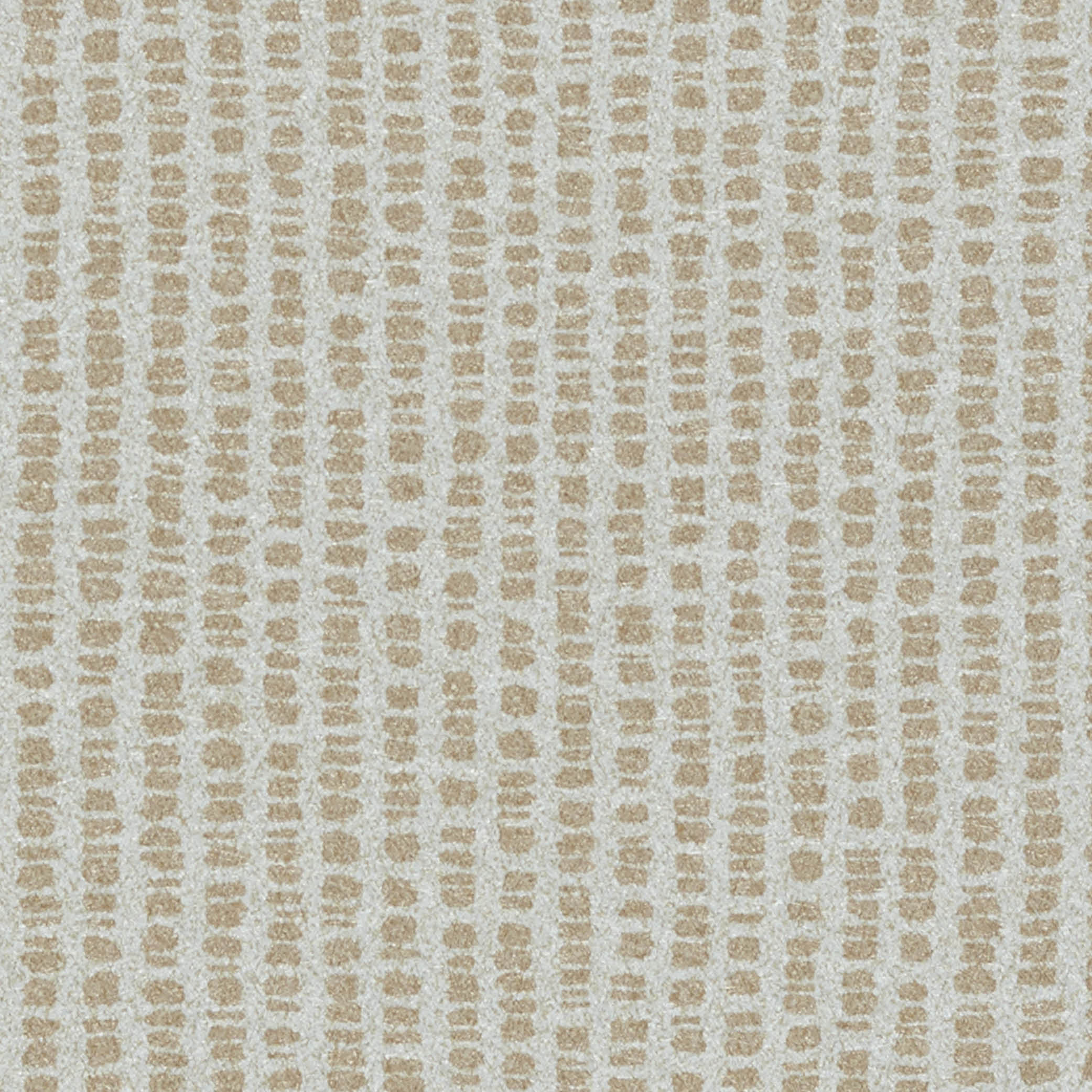
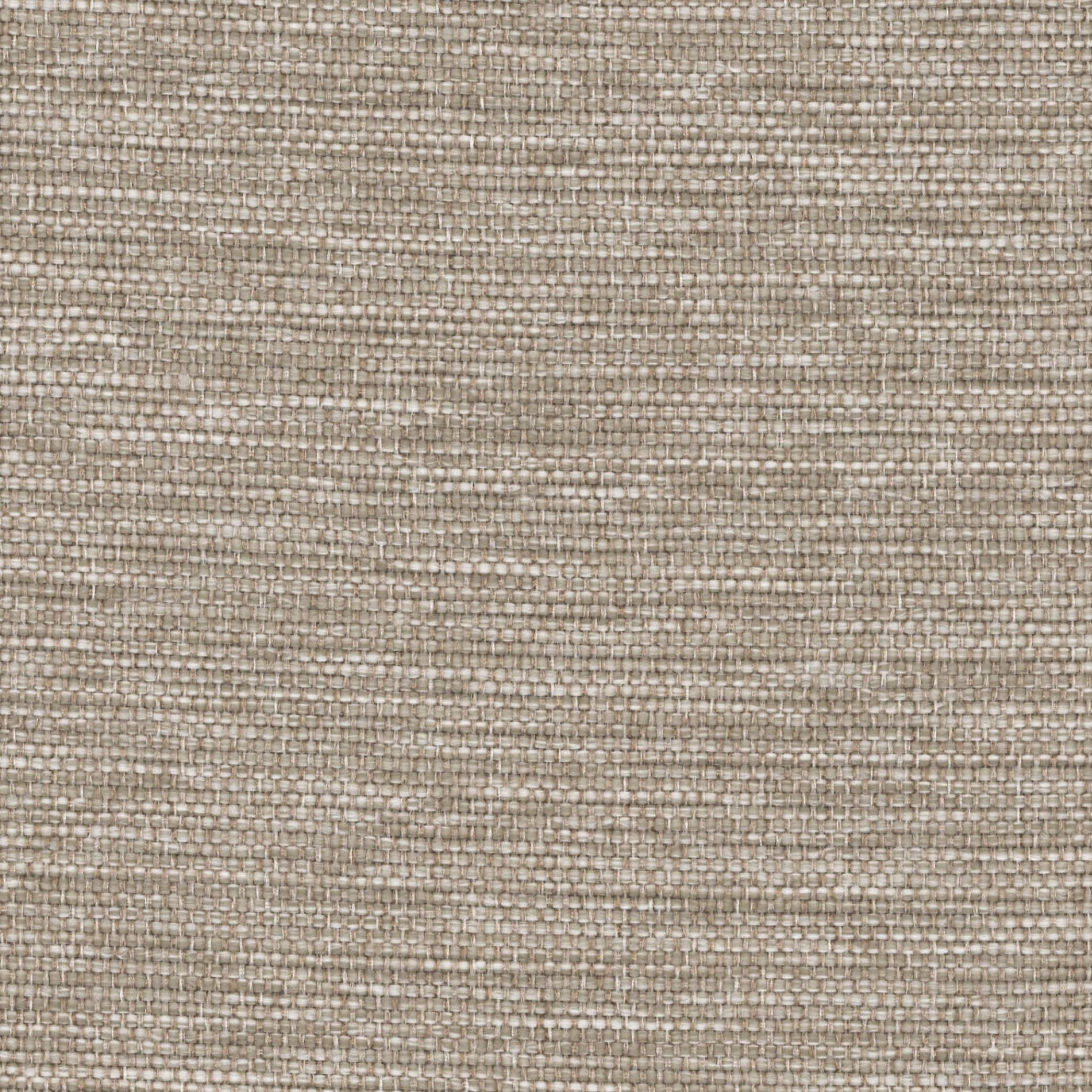
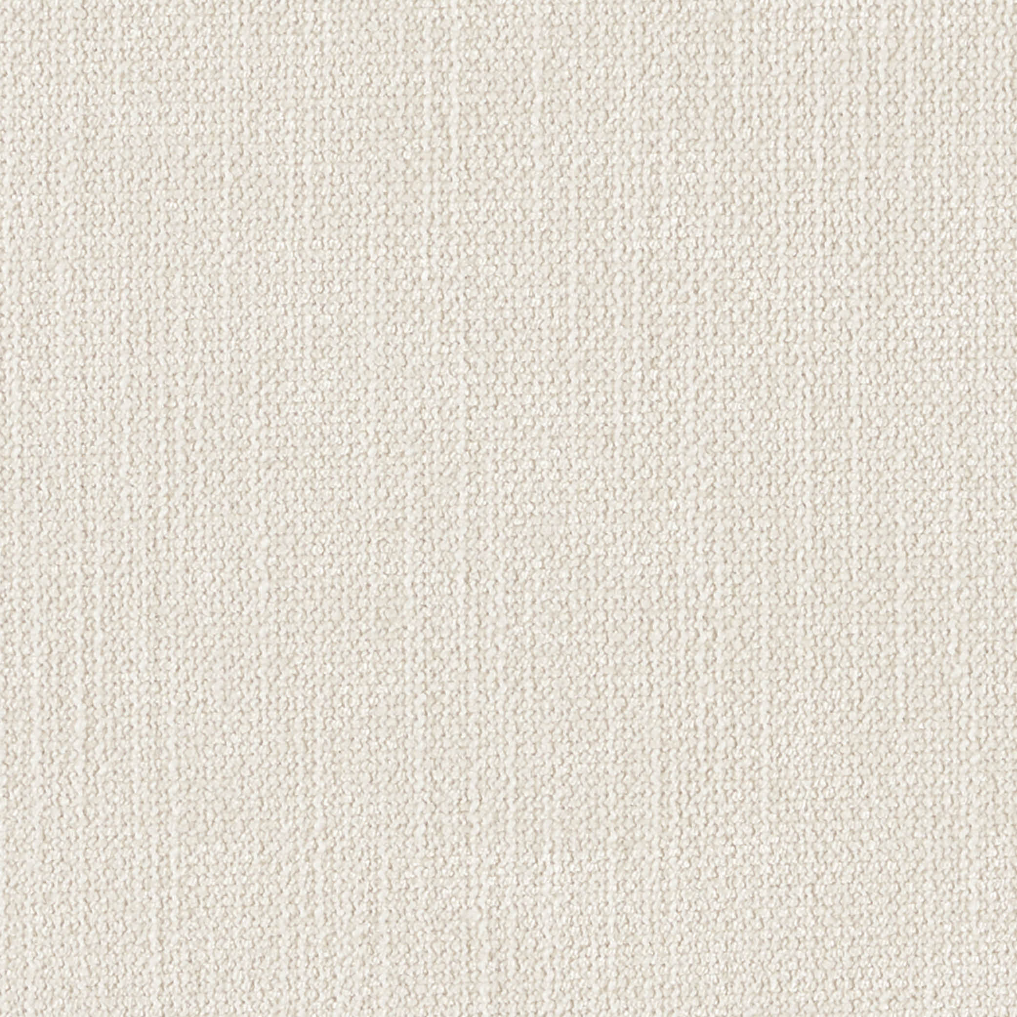
Warm Neutrals Clean, Simple, Modern
Neutrals have been moving to a warmer cast this past year and will continue through 2022 into 2023, bringing to mind comfort and warmth. Layered neutrals include warmer whites combined with soft beige and taupe and are often seen in nature, fashion and Scandinavian design.
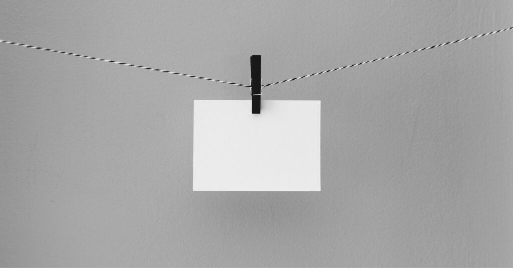


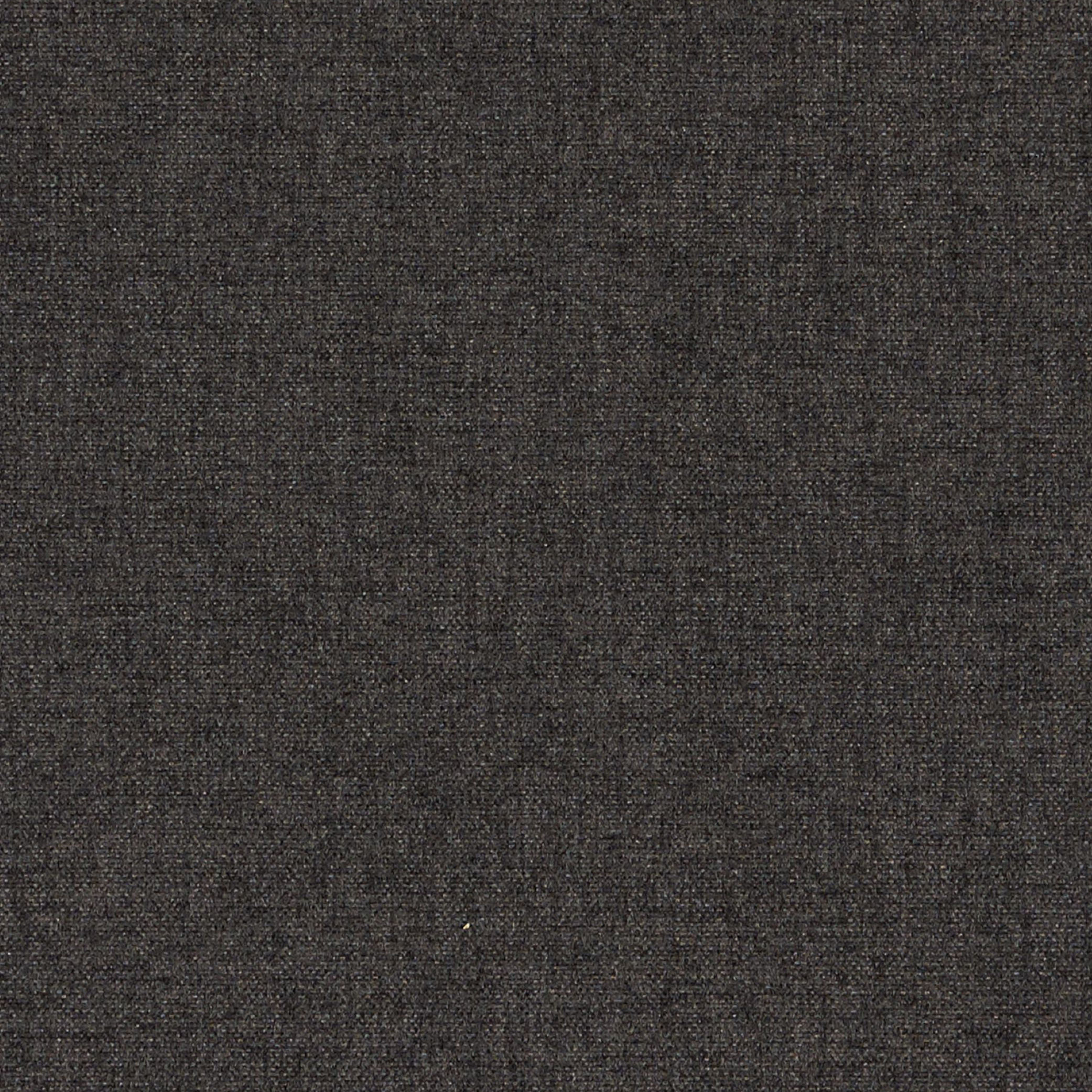
Black and White Contrasting, Powerful, Striking
The relationship between these two non-colors, or what is called achromatic, meaning without color, is striking. While white represents purity, virtue and innocence, black portrays a darker, more mysterious side which is why these two contrasting colors work so well when partnered together.
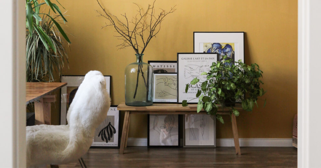
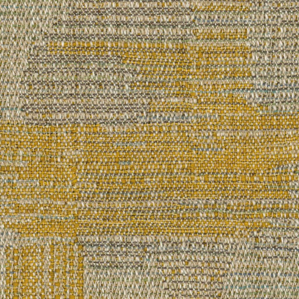
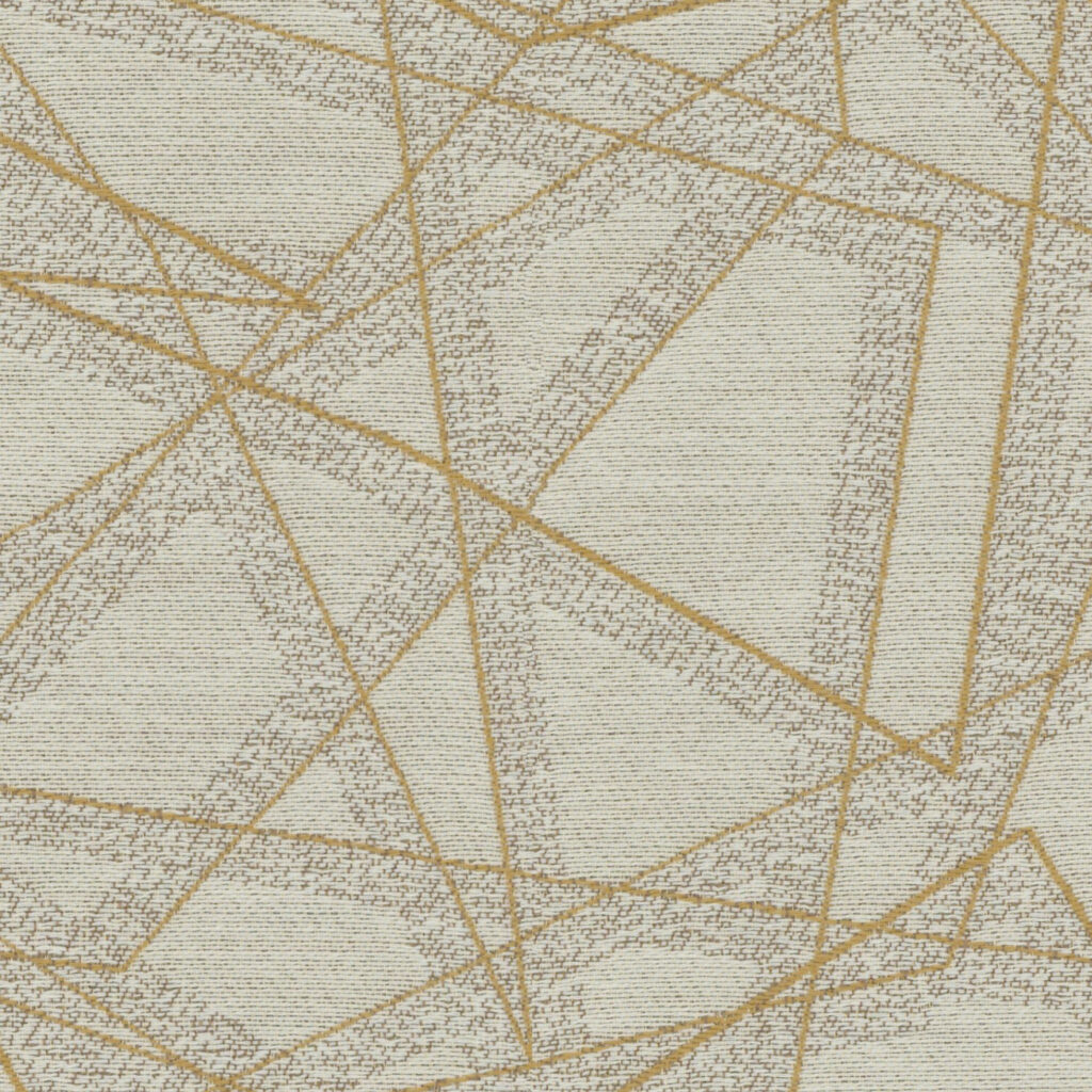

Yarrow Confident, Optimistic, Dramatic
In general, yellow, known as a cheerful color, is often linked to the powerful strength of the sun and represents light and energy. The color Yarrow, a muted mid-toned yellow with a slight kiss of orange, is the color of this captivating perennial that blooms in the summer.
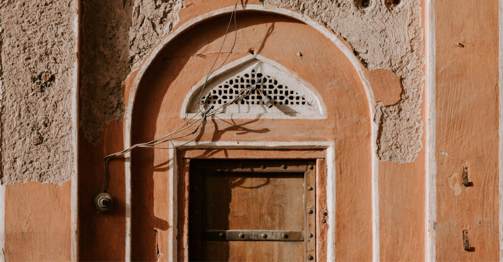
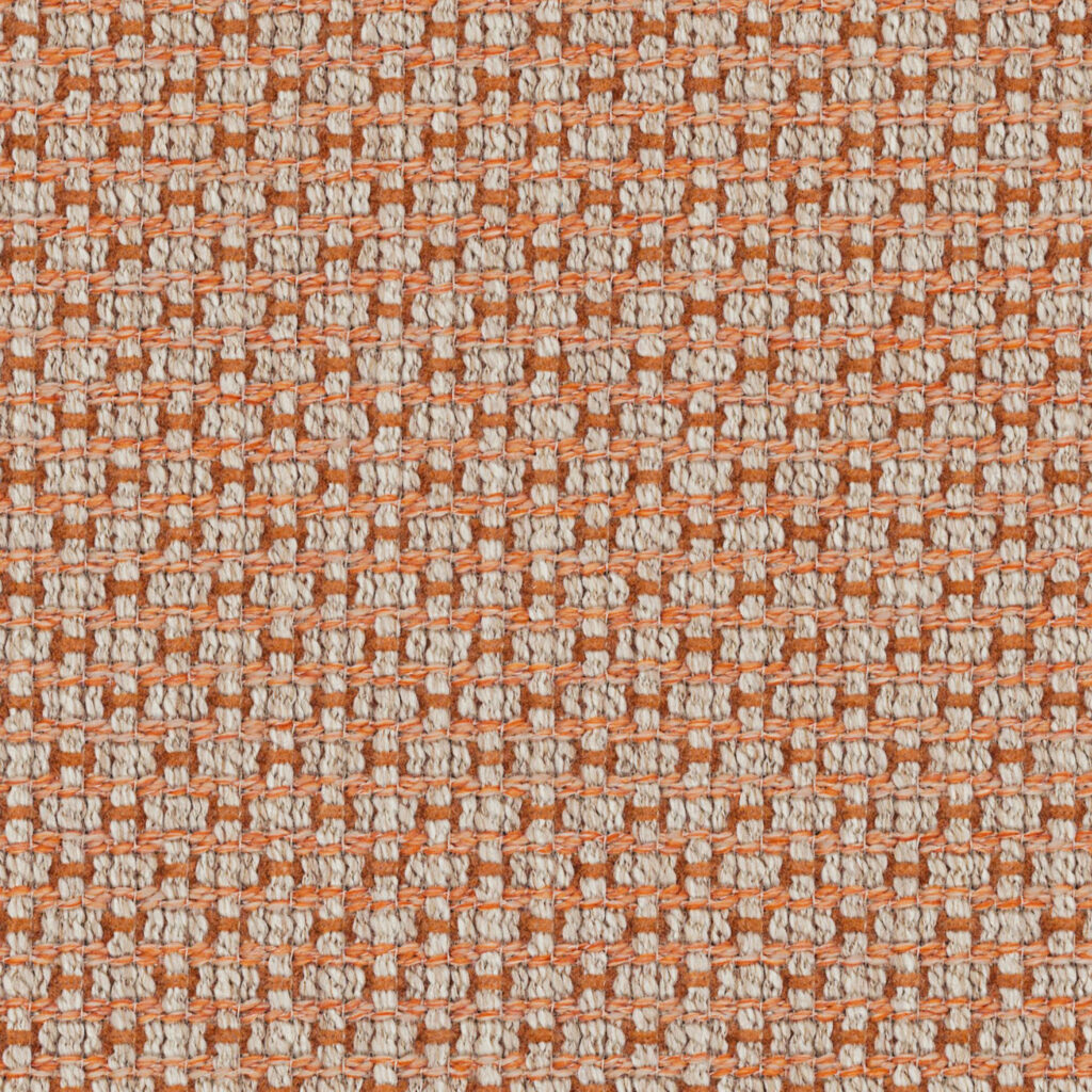
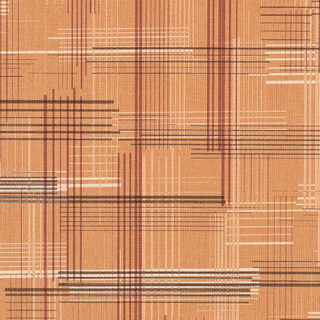
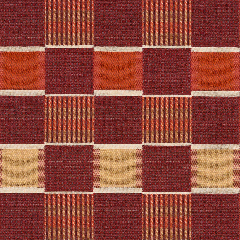
Chai Complex, Earthy, Grounded
Chai, is a unique, complex blend of aromatic herbs and spices, when combined create a enticing tea. This particular organic color, along with the soft color of clay terra cotta center around an earthy global palette growing in today’s interiors.
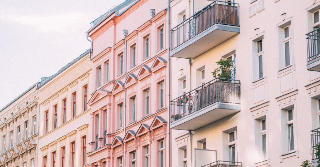


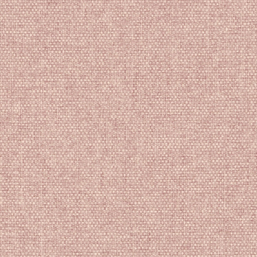
Petal Soft, Calm, Soothing
Petal is a soft and delicate pink and the best way to makes its beauty stand out is to juxtapose it with natural tones or even natural materials like concrete, stone and wood.
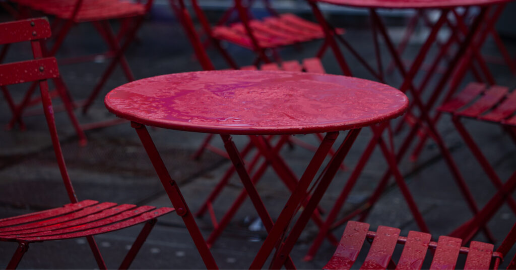

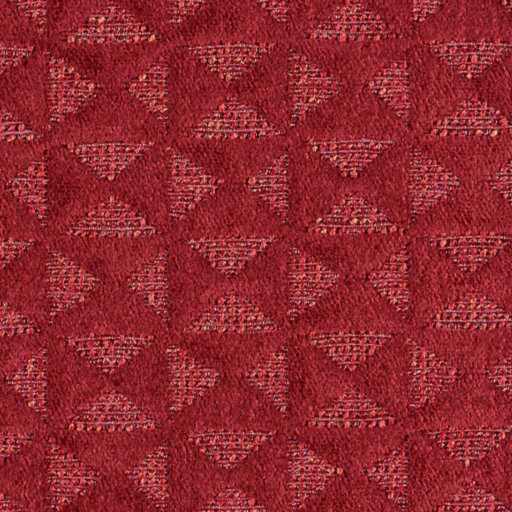

Poppy Bold, Strong, Passionate
Poppy Red has a bright, clear quality to it and is a readily identifiable color thanks to its popularity. Red poppies are a symbol of remembrance for fallen soldiers and wearing a poppy was inspired by the fields of poppies that grew where many of the battles were fought.
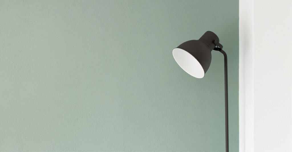
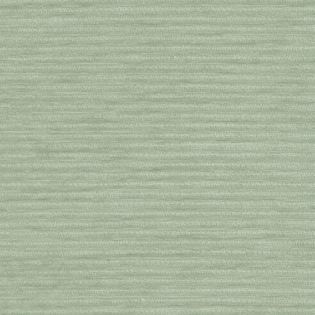

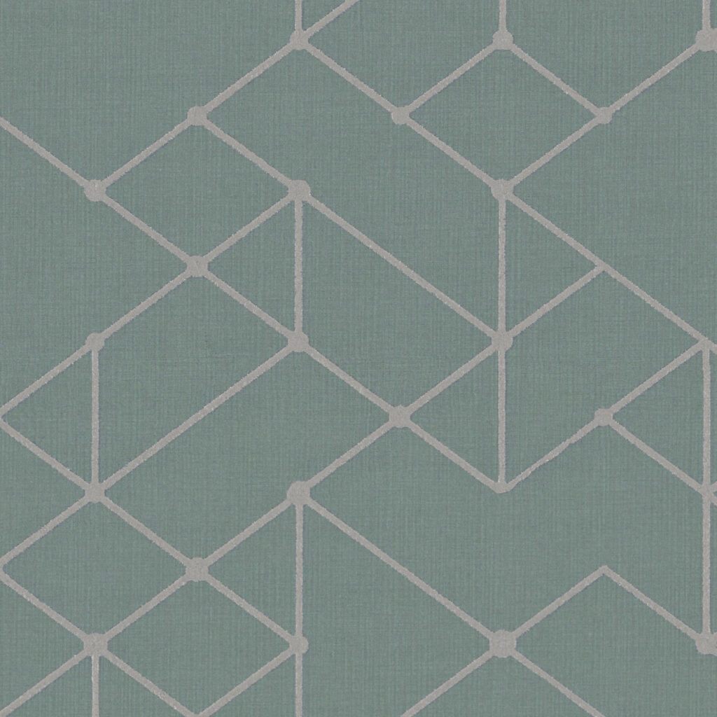
Eucalyptus Calm, Serene, Restorative
This trademark shade of green is associated with the Eucalyptus leaf, a dusty green with undertones of silver, gray and blue and can feel equal parts of serene, rejuvenating and invigorating. It’s a color that’s relaxed, tranquil and natural.
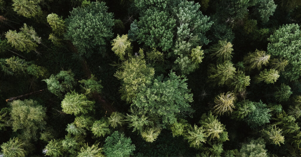
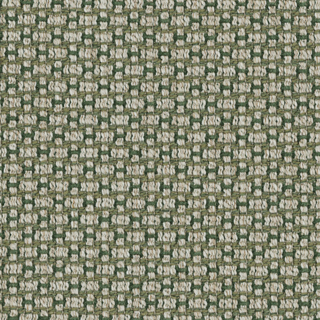


Foliage Nature, Organic, Biophilic
This year will stay close to hues found in nature. Vibrant green gardens filled with the soft green of succulents, cacti to the lush deep greens of the forest, all greens associated with biophilic design to promote wellness and our love of nature.
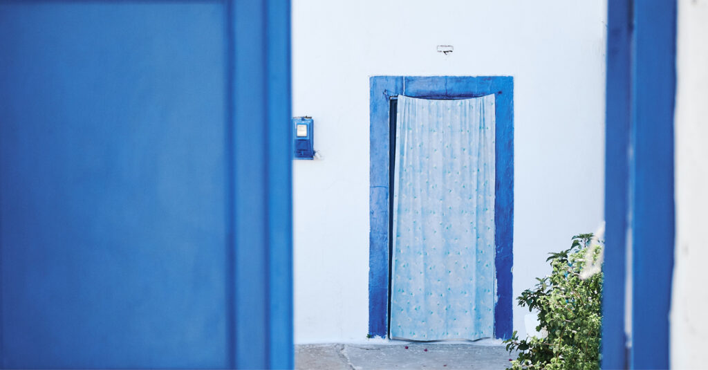
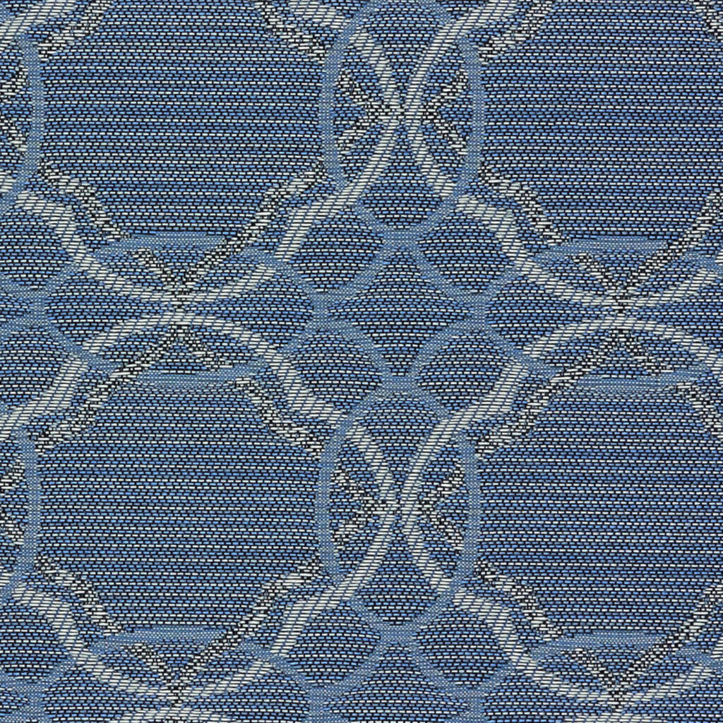
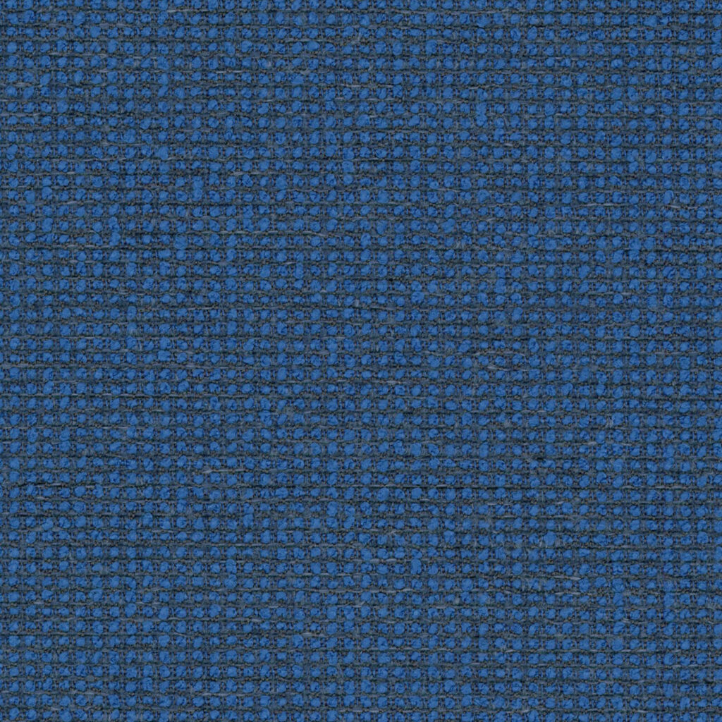
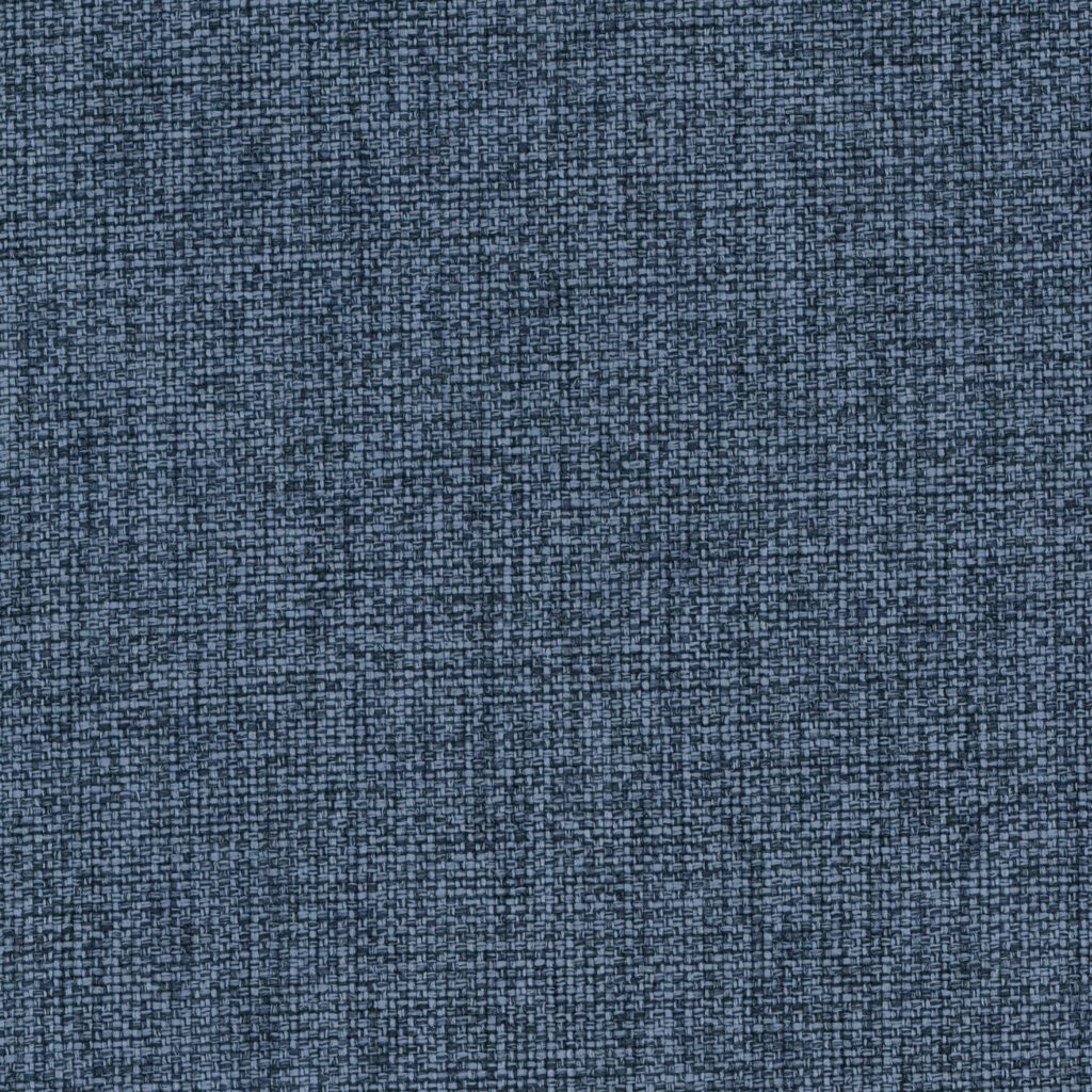
Cerulean Versatile, Comforting, Timeless
Cerulean is a shade of blue ranging between azure and a darker sky blue, a soothing and calming color that evokes feelings of peace and confidence. Blue, by far is the top selling color and loved by all.
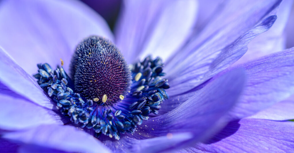
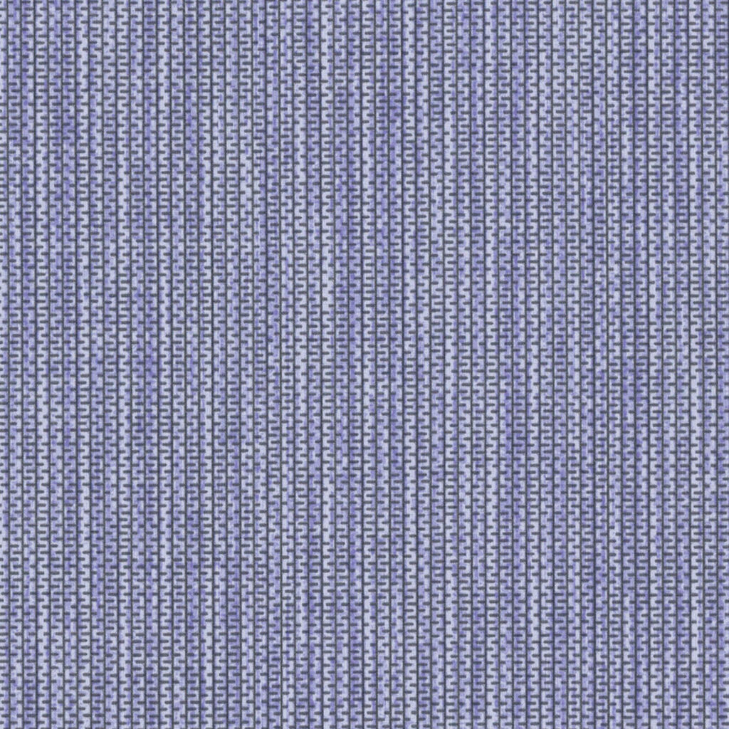
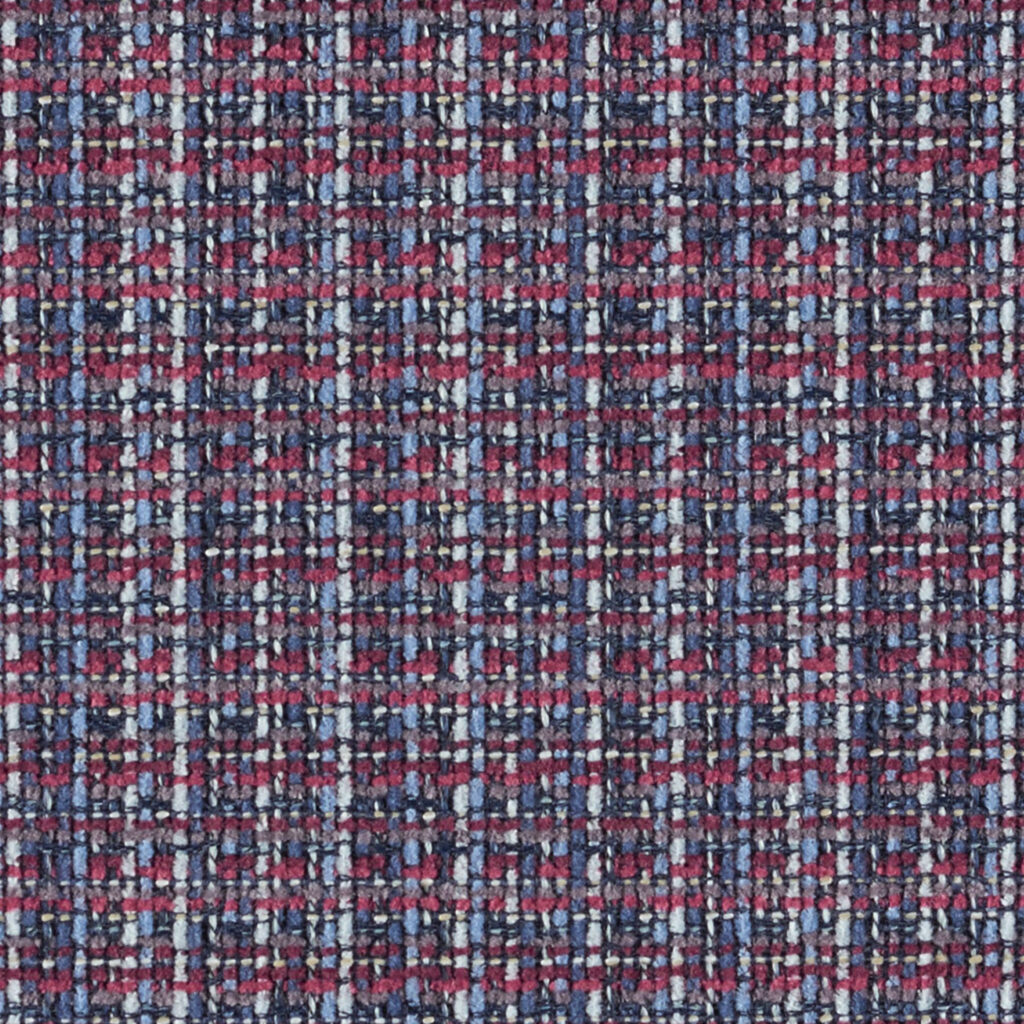

Veri Peri Daring, Carefree, Intriguing
We would be remiss if we didn’t touch on the Pantone color of the year, Very Peri. Carefree, daring with a touch of curiosity, this color animates our creative spirit and promotes inventiveness. People ask, is this a purple or blue. The color blends the faithfulness and constancy of blue with energy and excitement of red.
Looking for a specific color or project inspiration? Find it within a few clicks using our new ‘Colors’ filter bar or browse our ‘Industry Insights’ for the latest in color trends.
